In the digital age, smartphone become a norm to most of people. The site needed to be responsive so that users can browse easily without the needed to zoom in.
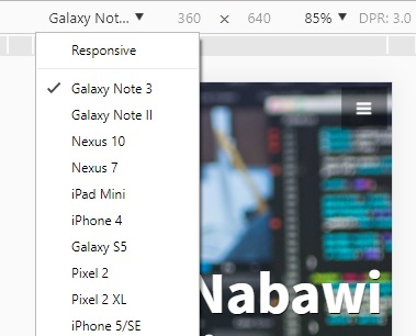
We have many different sizes of the phone including tablet. So to have responsiveness we will detect the width of the open applications. In Desktop browser you can check the size accordingly, or you can emulate the phone. Right click at your browser and choose Inspect Element

Now come the tricky part. The code for the CSS.
To enabled the view of mobile ration first we must enable the viewport set to 1 in the initial width. Add below code in the <head>
<meta name="viewport" content="width=device-width, initial-scale=1">Now once it done in the CSS you can check the width by using @media. Specify the max width based on the device. Below are the example of the style been done.
<style>
.example {
background-image: url("https://example.com/image.jpg");
}
@media only screen and (max-width: 700px) {
.example {
background-image: none;
}
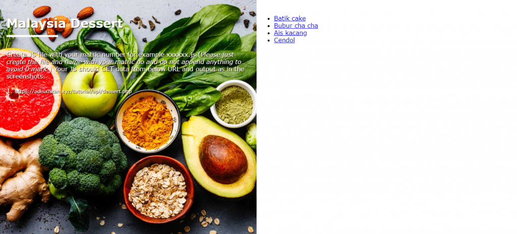
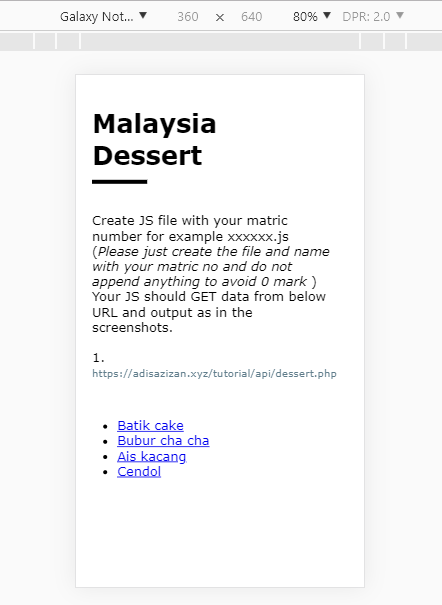
</style>This code will allow the background image not to be shown if the width of the device/browser less than 700px. You can see example of this in here
https://portfolio.adisazizan.xyz/wp-content/uploads/2019/04/quiz3-v2.html
You can resize the browser to see the changes.